02Identity
The mark, and where it lives.
The logo is a fixed, professionally-designed system — not a single file. It ships as six related marks: two lockups (horizontal and stacked), the icon on its own, an initials monogram, a circular badge, and a social avatar. Each comes in a full-color, a mono, and a reversed colorway. Pick the mark that fits the space, then use the supplied PNG — never rebuild it.
Six marks, one system.
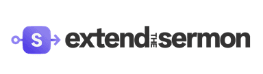
The lockups lead. Everything else exists so the brand still reads when the full lockup won't fit — a favicon, a profile circle, a watermark, a sticker.
Horizontal
Lead lockup — nav, headers, footers, email
Stacked
Hero / formal — big moments, print, square spaces
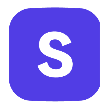
Icon
Favicons, app tile, avatars, tight spaces
Initials
Compact wordmark — watermarks, merch, small-format
Badge
Seals, stickers, social watermark stamp
Social avatar
Profile circle across every platform
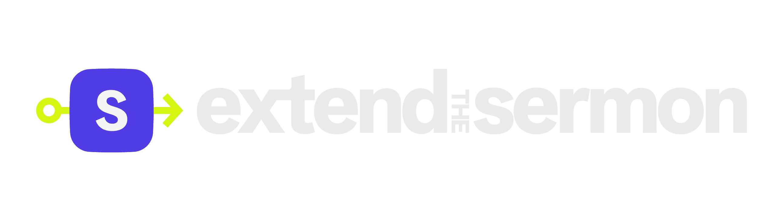
Every mark, on light and dark.
Use the full-color colorway on cream and other light surfaces; use the reversed colorway on charcoal, deep-violet, and photography. Every mark below also ships a mono (single-charcoal) and a pure-white version in public/brand-guide/.
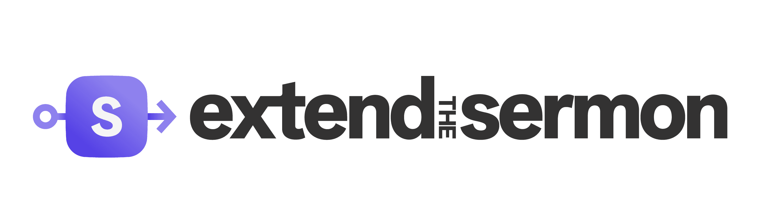
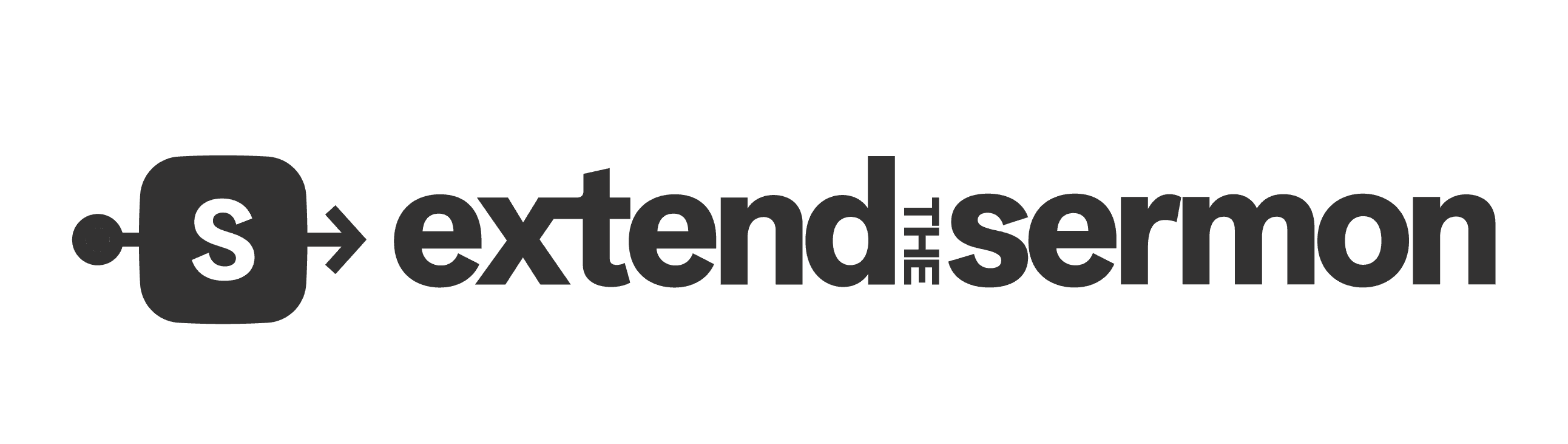
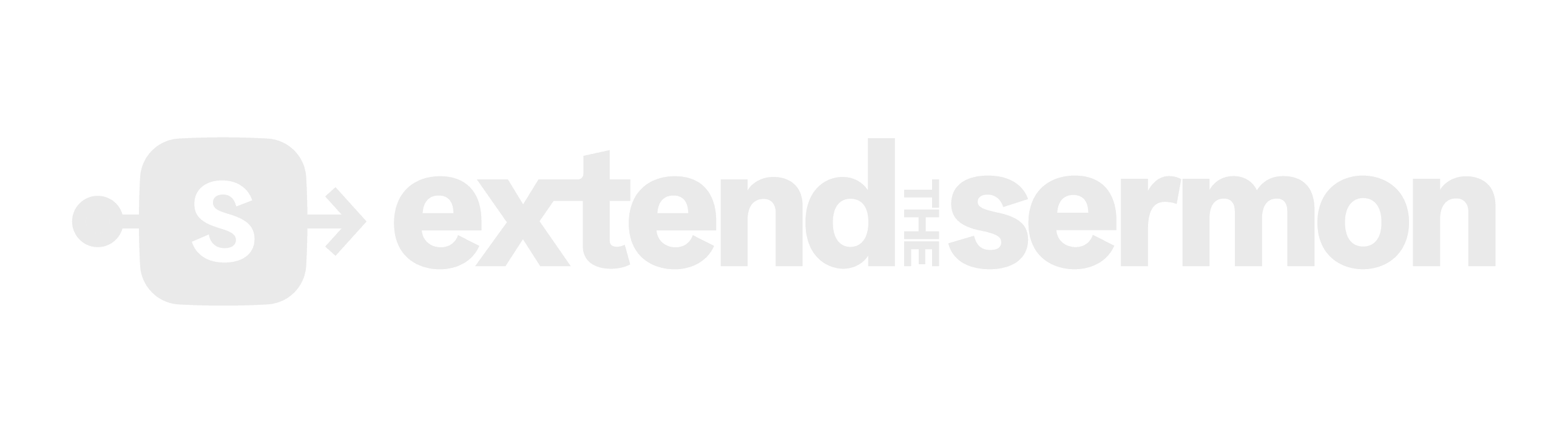
A · Horizontal lockup — the lead
Icon beside wordmark. The everyday mark: site nav, headers, footers, email signatures — anywhere wide and short. This is the one people see most. On the purple footer, use the reversed colorway so the wordmark stays legible.
On cream · on charcoalets-header-logo.png · ets-header-logo-dark.png
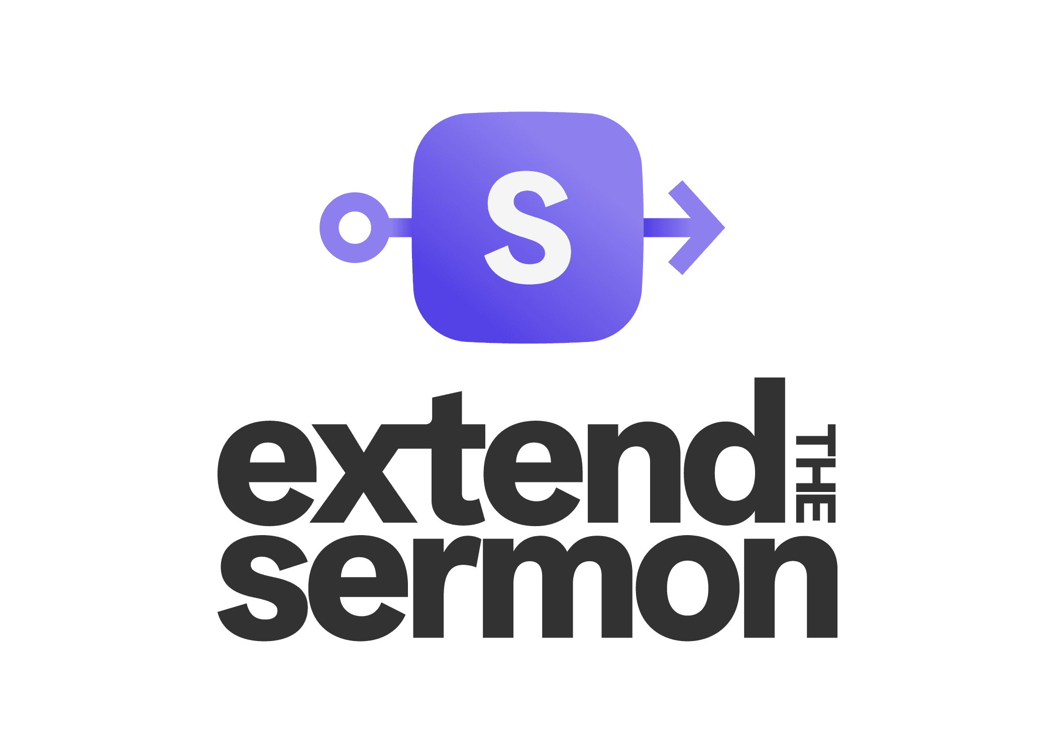
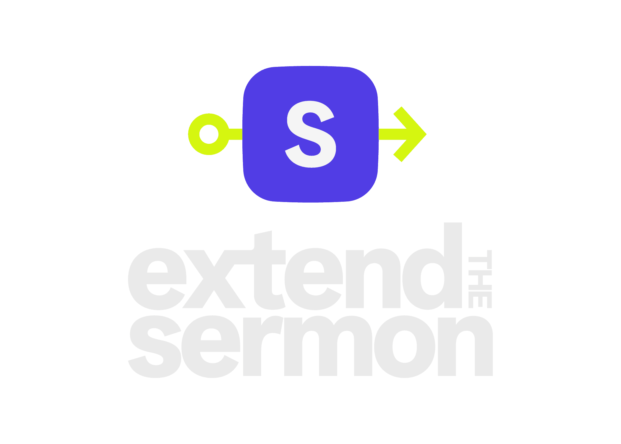
B · Stacked lockup — hero / formal
Icon over wordmark. Reach for it in hero sections, on print, and in square or vertical spaces where the horizontal would shrink too far. This is the most complete, self-contained expression of the mark.
On cream · on charcoalets-primary-logo.png · stacked-color-dark.png
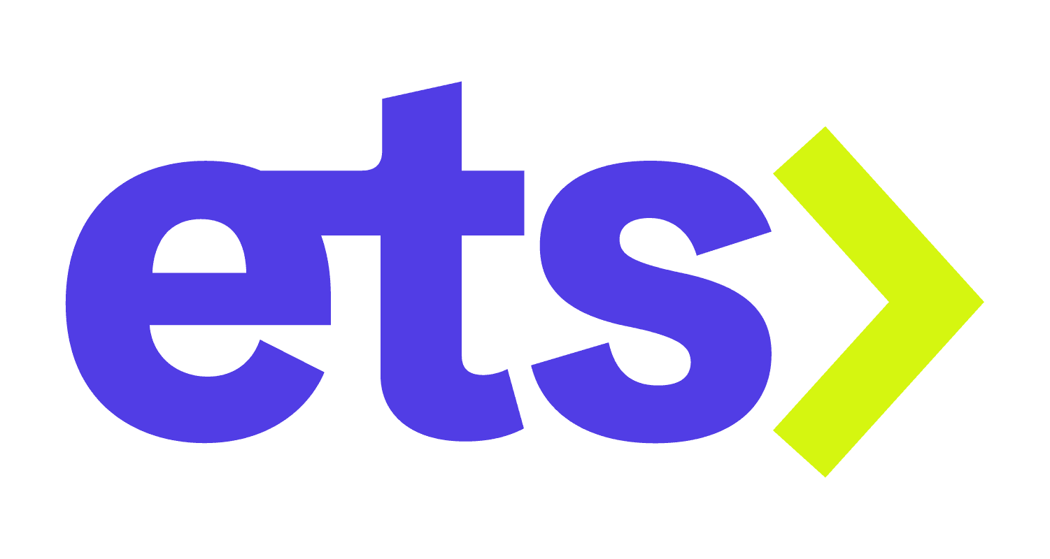
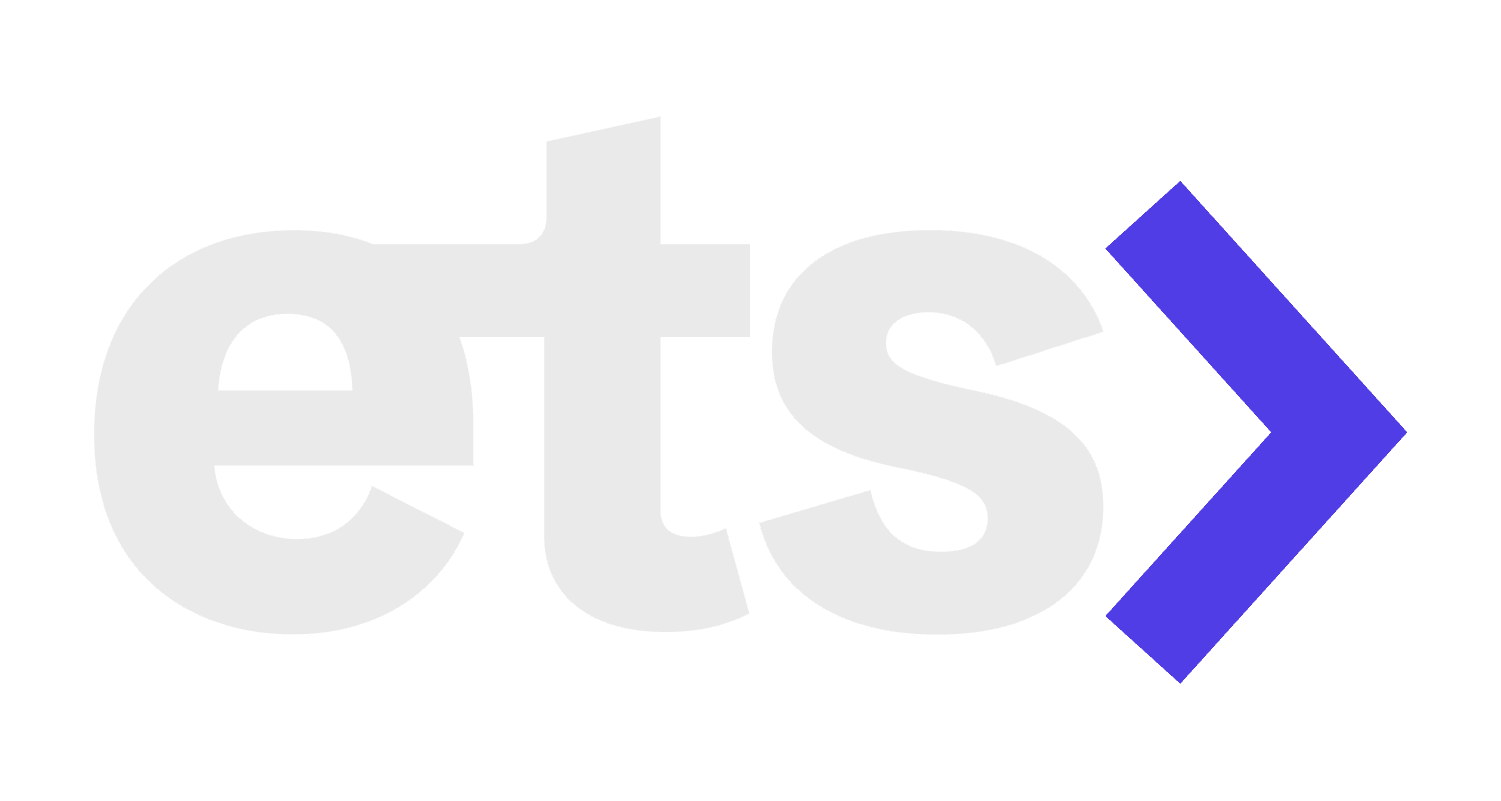
C · Icon — the S-mark alone
The standalone glyph: the S-block with its input node and output arrow. Favicons, the app tile, avatars, loading states, and any spot too tight for a wordmark. Below 32px the ports become noise — the favicon set uses a simplified S-tile (see §09).
On cream · on charcoalets-icon.png · icon-color-dark.png
D · Initials monogram — “ets›”
A compact lowercase wordmark with the lime chevron. Use it as a watermark, on merch, or in tight footers where the full lockup is too tall — a quieter alternate signature, never a replacement for the lockup in primary positions.
On cream · on charcoalinitials-color.png · initials-color-dark.png
E · Badge & social avatar — the round marks
The badge is a circular seal — the filled charcoal disc with the lime outlined S-mark and the curved “EXTEND THE / SERMON” wordmark. Use it for stickers, stamps, and as a social watermark. The social avatar is the icon on the brand cream, cropped square for profile circles across every platform.
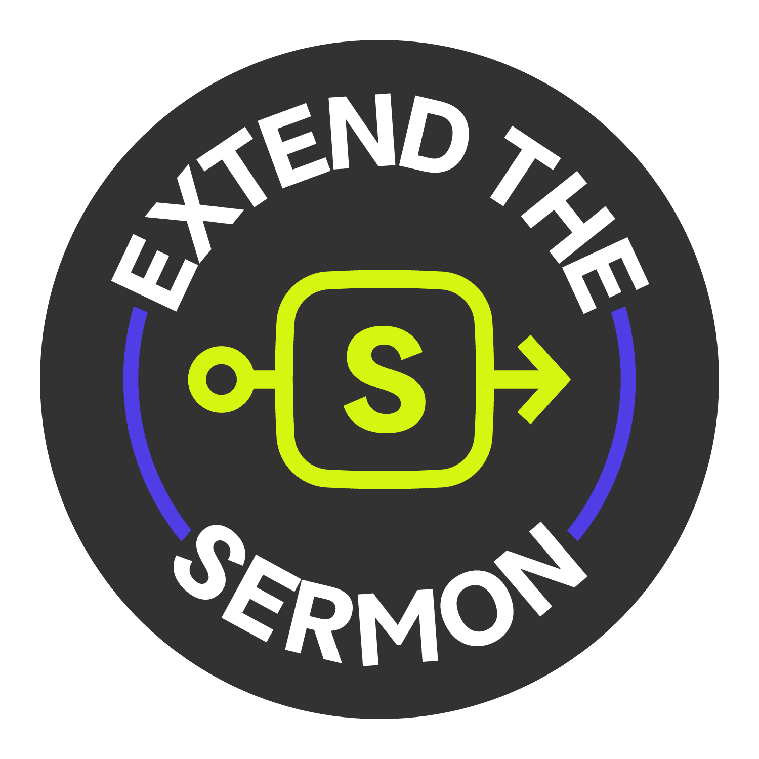 Badge · filled seal · ets-badge.png
 Social avatar · profile circle · ets-social-avatar.jpg
Colorways & where each is approved.
Every lockup, icon, and monogram ships four colorways. Match the colorway to the surface — never recolor a mark by hand.
Full-color
Cream and other light surfaces. The default.
Mono (charcoal)
One-color print, faxes, embossing, stamps.
Reversed color
Charcoal & deep-violet panels, dark photography.
White
The purple footer, busy photos, video lower-thirds.


